UX/UI Design

Travel.State.Gov

A government website redesign for responsive desktop, tablet, mobile.

Role

Co-UX researcher
UI Designer

Platform

Desktop, Tablet, Mobile

Tools

Figma, unDraw, Illustrator, Zoom, Google Drive

Timeline

5 weeks

Project Overview

This is the process of my first unsolicited website redesign. The UX/UI Design bootcamp gave designers the challenge of selecting a government website to evaluate and overhaul the design of a user’s journey accomplishing a specific task. 

Fellow bootcamp student Michaela Dardar partnered with me to select this website and conduct a heuristic evaluation and current website usability testing with people from our network who we know like to travel internationally.

Although Travel.State.gov serves many purposes depending on a user’s needs, we decided to focus on one path for users specifically looking to apply for a new passport. We selected this website and user flow because we both love to travel and have had to go through the process of getting a passport ourselves, so we have experienced using this website to obtain the correct information. We found it frustrating and overwhelming to use so we felt investment in improving it. 

User flow, user research, research insights

Card sorting, style guide

Wireframing, low fidelity mock ups

User tasks, iterations

High fidelity mock ups

Lessons learned & next steps

Discovery & Definition

Research Process

The first step was defining the necessary pages a user would need to interact with in order to complete the task of learning how to apply for a new passport. This helped to define the scope of the project by guiding which information to focus on and which pages needed to be reconstructed. 

To apply for a new passport, it is essential to find a location to go apply in person (there is not a by-mail or electronic option for this process) and make sure to bring all the necessary documentation. Additionally, a user must be sure they fit the eligibility requirements to go through this process. If they do not, it is an entirely different path they will need to follow.

We decided our user’s task to evaluate the usability of our own redesigns was to use the website to find a location to apply in person.

Next, we annotated the existing pages to target areas of improvement in both design and information architecture as if we were presenting our findings to a real client.

Finally, we conducted user research to gather feedback from a broader audience to validate our own experiences and ensure that we addressed the most common pain points faced by users. Usability testing with the current site and card sorting sessions provided valuable insights and help us prioritize the improvements needed. We practiced contextual inquiry by observing our users’ path actions to complete the defined task and asking questions about their choices, how it made them feel, and what they found frustrating versus helpful.

3 Original Site Usability Tests

All female, over 18 years old

3 Card Sorting Exercises

Same users as usability tests

Key Research Insights

Our research revealed 3 key insights into the current site usability.

The button to find a location is difficult to find.

Users said it was “tedious having to scroll all the way down the page to find this option” that it could be organized differently on the page so it can be easily found without too much thought. They felt this way even with a button at the top of the page, as they did not notice it in the right side navigation. Why? The page was too cluttered for them to easily find it.

The format for the instructions for different age groups does not make sense.

Whereas the first page reads ‘I’m an adult’ for passport application, the following page does not match with the same format and only mention those who are under 16 & those who are between 16 & 17. It is a lot of clicking back and forth to actually obtain very similar information. It would be easier to understand if all info was on the same page for those needing to fill out the same form.

The location page has an inconsistent design from the rest of the page and no map feature.

Users felt it was frustrating to have to copy and paste the address or name of the facility from search results into Google Maps in order to visualize how far it is and compare where they should go to apply to their passport in person.

Ideation

Moodboard & Style Guide

Once the user flow was established and user research had been conducted, Michaela and I embarked on our respective individual projects as solo UI designers. A mood board and style tiles were created to guide the aesthetic portion of the redesign. The components and styles were used to construct the design on different platforms.

Design

The next step was to begin the process of designing the wireframes and low fidelity mock ups. Figma was used to create each visual element from wireframe to prototype utilizing atomic design to create a component library for consistent design.

Usability Testing

New users were given the same task to complete as those navigating the original site in order to test the usability of the redesign. I was specifically interested in how to present the information contained in the “steps” outlined on the original site. One challenge I ran into was the fact that the order of the “steps” did not necessarily matter, so long as the last step was obtaining the passport. The original site featured large paragraphs of information that users had skipped over for the most part because it was too long. To combat this challenge, A/B tests were conducted. Did users prefer a list that could expand down for more details (option A, pictured on the left) or did they want to see all the information laid out in a more engaging way than a list (option B, pictured on the right)?

Design A

Design B

Results & Insights

According to user feedback, seeing all the steps at once with more condensed, chunked information made it much easier to digest. They really enjoyed the use of icons and a visual path element for their eyes to follow. The only worry was with consideration to responsive design — this visual aid would not translate well on a mobile view. With this in mind, I chose design B for the steps on desktop and tablet view and design A for the mobile view.

High Fidelity Designs

Selected designs, side by side with original site design.

Conclusion

Next Steps

The next steps for this redesign would be to create user paths in similar, engaging formats for other tasks users use this site for. I would be particularly excited to imagine how to make this a resource that is user-friendly for Americans preparing to travel abroad who need a resource-hub for international travel news & alerts. Right now, the site provides that information in dense paragraphs and it is relatively hard to find what you are looking for when it comes to specific countries one may be traveling to.

Lessons Learned

This project was a massive undertaking due to the large amount of information contained within the site. The final design depended heavily on the defined user path I was interested in recreating. From card sorting to reorganizing the information architecture of the site to testing the usability of prototypes, every step involved multiple iterations and hard choices to keep the end user’s goal in mind. 
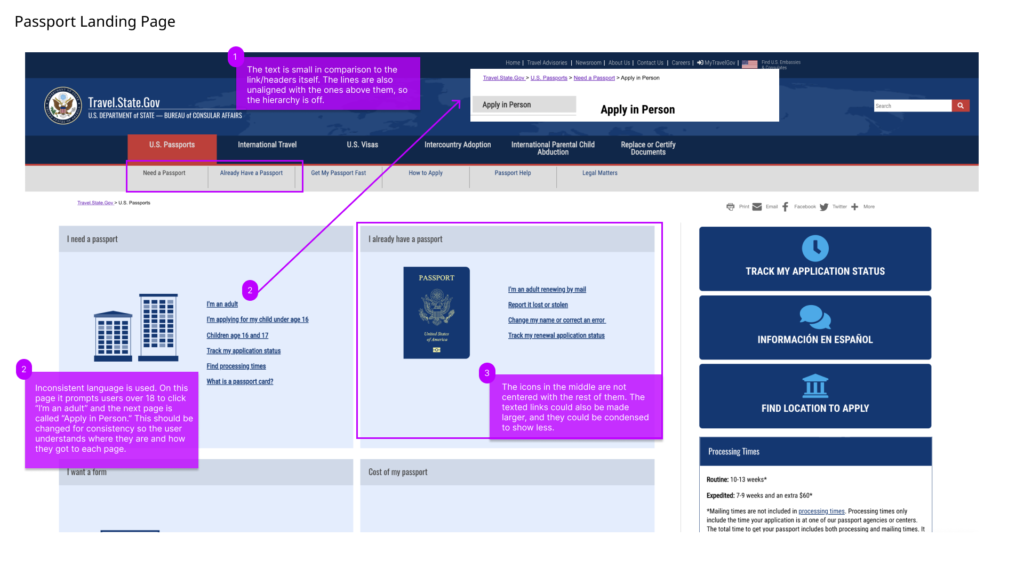
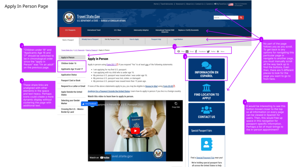
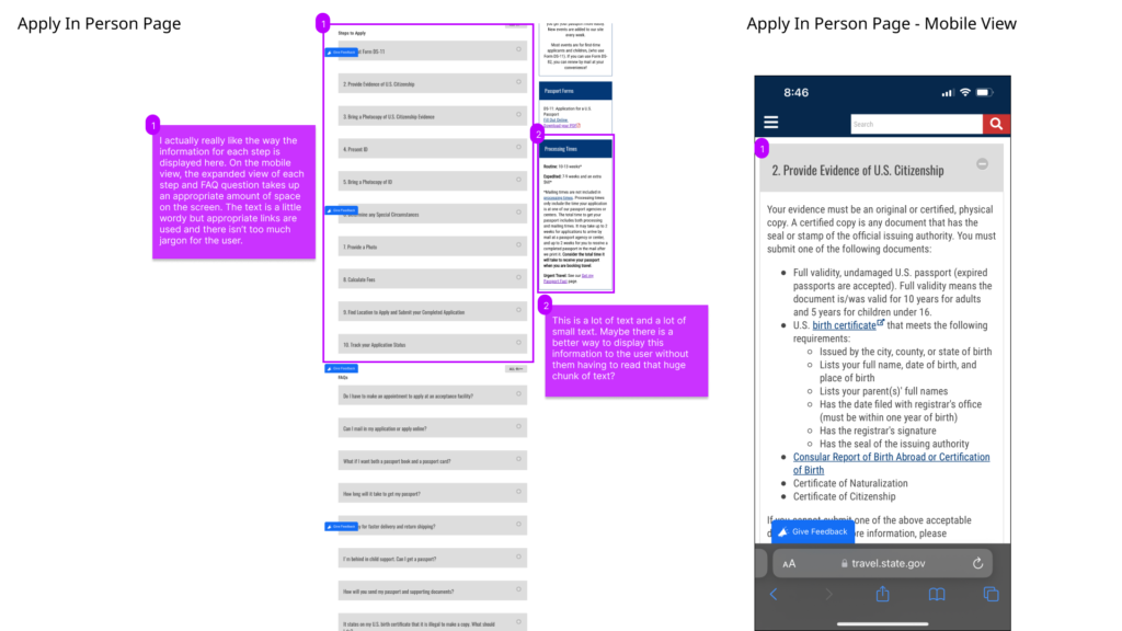
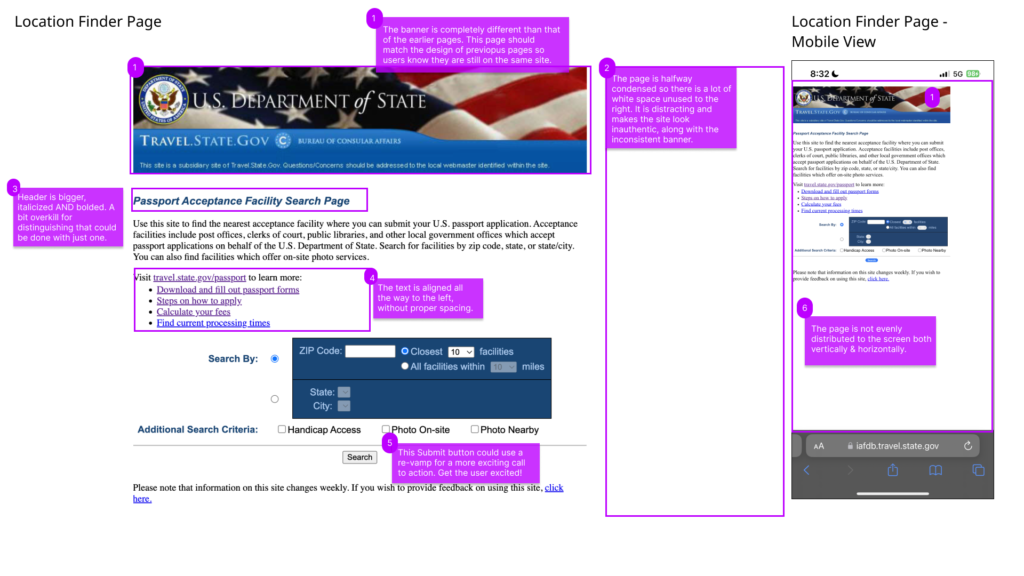
The fact that this site only gives the information on how to complete a task but does not facilitate the completion of the task through the site (new passports must be applied for in person at a facility) added an extra layer of difficulty to this process. Ultimately, I chose to chunk the dense information into visually appealing and interactive sections that closely mirrored a web app for the mobile view because a majority of the users would likely be accessing the information through their phone. There is not a lot of real estate on a mobile view, so it was vital to include collapsable components and separate pages to navigate without thinking too hard. While the original site’s responsive design required users to navigate through several pages to get their information, they did a poor job of making it visually digestible.

I am proud of the redesign I created for this site. It is a very important site for all Americans wishing to travel outside the country, an experience which can vastly enrich users’ lives. According to the CDC, “travel-related stress can spark mood changes, depression, and anxiety.” (https://wwwnc.cdc.gov/travel/page/mental-health) Therefore, having a clear understanding of what is needed in order to prepare for international travel through use of Travel.state.gov can play a big part in relieving or preventing that stress for users.
The biggest lesson I learned from this process was to not be afraid to go back to the drawing board and begin again based on user feedback!

Scroll to Top