UX/UI DESIGN
Little Light Embroidery

An e-commerce site & brand redesign for a local small business.
Role
Project Manager
UX/UI designer
Platform
Mobile, desktop
Tools
Figma, unDraw, Illustrator, Photoshop, Zoom, Google Drive
Timeline
4 weeks
Collaborators
Sandi Bancod, Ana Mathew, Blake Timmons
Project Overview
My team, selected by the bootcamp instruction team, was tasked with offering a local business or non-profit organization to a free website design/re-design.
Together, we discussed our strengths and target areas for personal improvement. Every designer felt they could improv their skills in every step of the process. Thus, tasks were delegated such that individuals had opportunities to work on the skills they desired to throughout the project. As the Project Manager, it was my responsibility to delegate these tasks, define the deadlines, and maintain organization in work flow to be sure we were able to meet and even exceed the required deliverables for our client within the allotted time frame.
Initial usability testing, heuristic evaluation, user research insights, user flow
User persona, storyboard, user journey map, sketching
Wireframing, style guide, low and mid fidelity mock ups
User tasks, iterations
High fidelity mock ups
Lessons learned & next steps
Discovery & Definition
Our client
We each reached out to our personal networks to see who may be interested and found my friend Ashley Vacek was open to exploring a redesign for her embroidery business. I know Ashley as a prominent figure in the Austin queer community because she is very involved in organizing crafting events and participating in local art markets hosted by The Little Gay Shop.
Her business began on Instagram and moved to Square. The majority of her sales come from in person markets and website sales from repeat customers. While she does have an existing website, it is pretty rudimentary and has not been updated in the years since it was first set up.
Once we had her go ahead to begin this project, we scheduled a kick off meeting with her to interview her as well as two follow up meetings: one at the halfway mark to present our progress and next steps, one when we wrapped up usability testing and developed a high fidelity prototype to show her.
My team went through the desktop and mobile versions of Ashley’s site to create a heuristic evaluation. We presented this evaluation to highlight the current site’s areas for improvement and our initial ideas for a more responsive design.
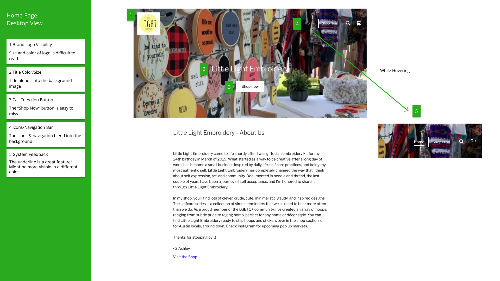
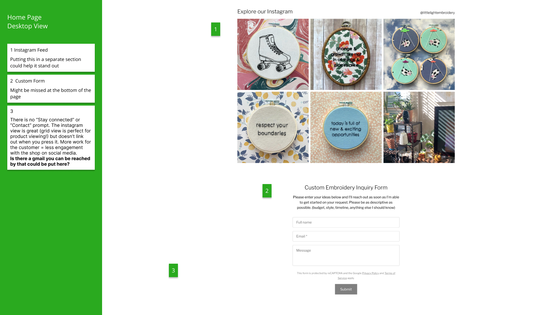
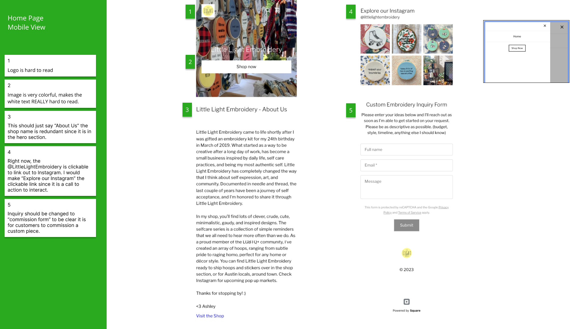
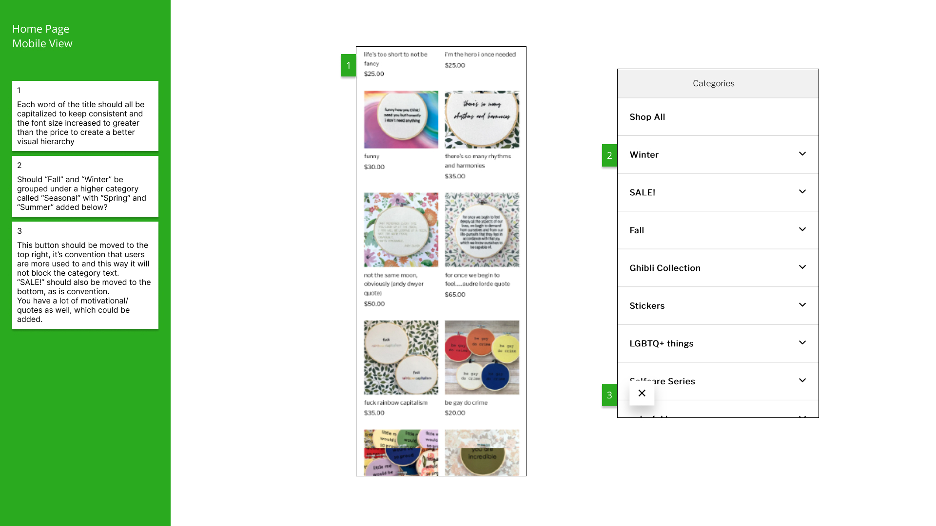
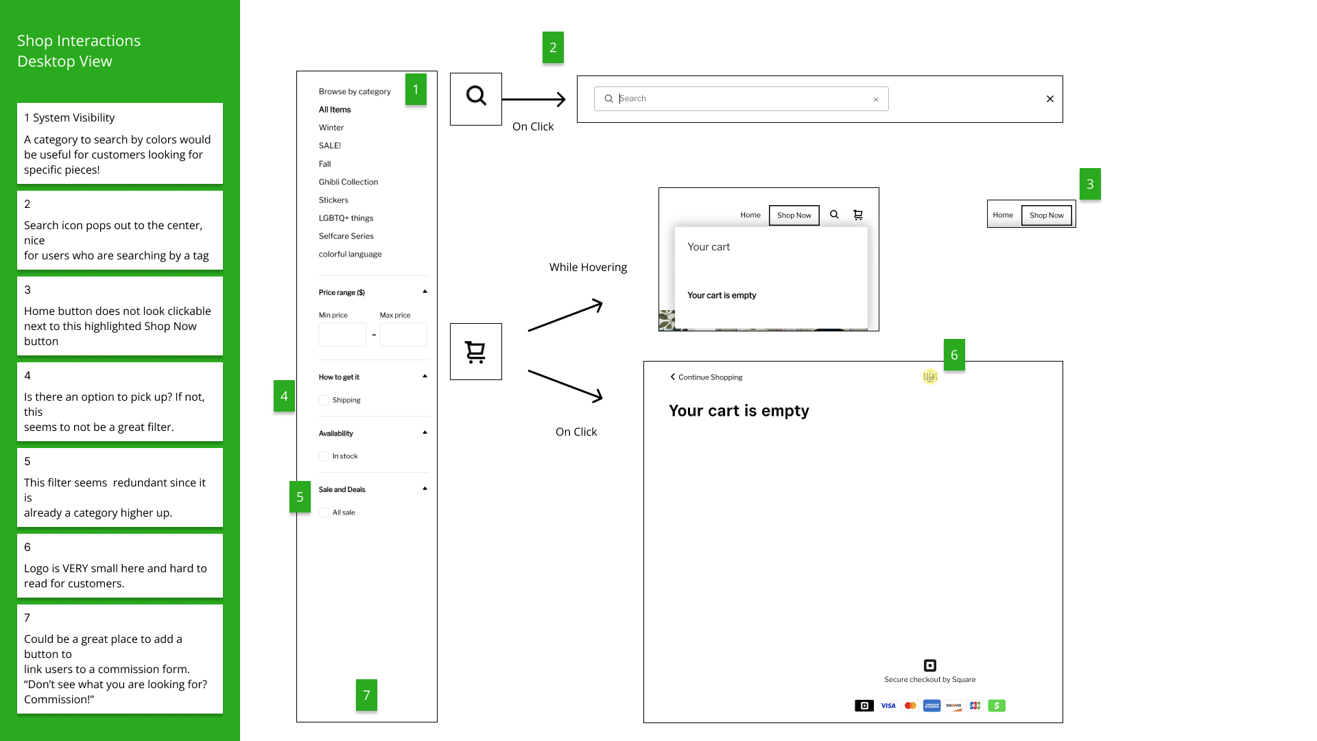
We then interviewed the client about her goals for her business and and the current challenges she faces as a small business. Ashley let us know she felt there was a disconnect between her site for selling products and her presence in the local art markets around the Austin area. She wants to not only sell more product online, but increase foot traffic at events so she can interact with the people taking home her work. Her identity as a queer artist is important for her to have reflected in her brand. Our mission was clear: Ashley needs a website that not only made the experience of buying her work online user friendly for her customers, but properly communicated how they can interact with her in real life at markets and events.
User Flow
The flow of each step a user would need to take to complete the task of checking out was outlined before starting testing so proper notation could be taken while observing users’ paths using the website.

Initial Usability Testing
5 Initial Usability Tests
2 males, 2 females, and 1 non-binary individual
ages 26-41
Google Survey
19 responses
Link sent out to bootcamp cohort, family, and networks.
After getting an understanding of our client’s needs, the next step was to gain an understanding of the customer who uses her site to purchase product. As a team, we each conducted a total of 5 usability tests of the current site and sent out a Google survey to our networks.
Based on our research data, we constructed a user persona, user journey map, and storyboard to keep in mind the end user – the customer!


Card Sorting
For each usability test, designers also presented the original site map and had users reorganize/add cards for greater clarity in site navigation.
Key Research Insights
Our survey revealed a majority of respondents identify purchasing from a small business as very important to them and 89.5% said they purchase art in effort to support an artist they know and/or like.
Initial usability testing revealed two important insights:
Poor Visibility, cluttered home page
Very low contrast between CTA buttons and images
Product uncertainty
Users were had to explore further than the homepage to understand what product is being sold
Ideation
Design Sprints
As project managed, it was my job to create and lead the team in several design sprints to begin the process of breaking down the original the site for redesign. First, we constructed a site map and practiced card sorting on our own and with a user we interviewed during our research.
Next, we defined our user flow and which pages were absolutely necessary to construct.
Each designer was then tasked with sketching the user flow for mobile and desktop view before coming together to do a timed c-sketch sprint. We moved clockwise in 5 minute increments to add comments and ideas to our teammates’ work, then came together to discuss the patterns and unique features we saw.

Features
Once we finished the design sprints, we were able to identify what features each of us had come up with to define clearly and prioritize designing in our mock ups.
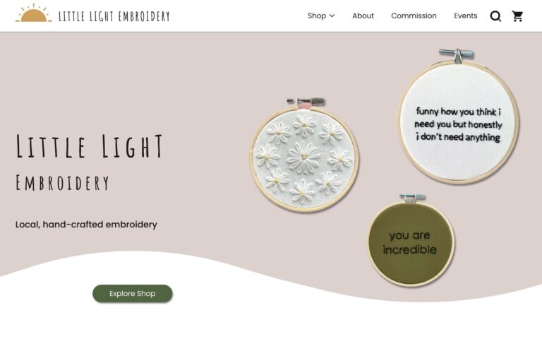
Inviting Home Page Design
Draw users in right away by showcasing excellent products!
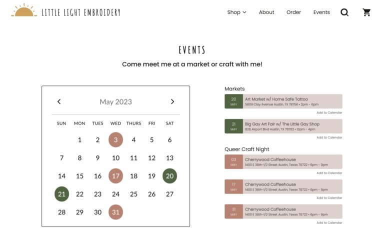
Monthly Calendar of Events
Highlight in person events to allow users to meet the artist
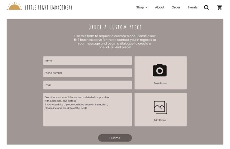
Clear Commission Form
Create option for commissioning a custom piece accessible to users on multiple pages
Improved Primary Navigation
Reorganize categories through based on card sorting exercise and create a mega menu
Design
Wireframing
We decided to have each designer pick a portion of the user flow to mock up at a low fidelity level. Based on these wireframes, a mid-fidelity prototype was constructed by me since I had the most desire to continue honing my skills in prototyping.
Visual Design Style Guide
Next, we all individually created moodboards, played around with reworking logos, and brought font pairings to the studio session. As a team we looked through each of them and pulled elements from each to create a final, combined moodboard, logo, and style guide.

I love how you all came up with different styles and pulled them together. It's cool to see similar elements in all of them, it just feels like y'all really got me!
Ashley Vacek
Usability Testing
Round 1 - Low Fidelity Mock Ups
Each designer participated in testing the usability of our redesign mock ups with new users and two versions to get feedback on. The same user path tested in initial usability was tested with 2 versions of desktop home pages and shop landing pages.
Blake Timmons and Sandi Bancod tested Home Page A + Shop A and Home Page A + Shop B, as well as the mobile prototype with their users. Ana Mathew and I tested Home Page B + Shop A and Home Page B + Shop B, as well as the mobile prototype with our users.

Home Page A
Central Tag Line

Home Page B
Hero Image

Shop Page A
Categories below a hero image

Shop Page B
No hero image, categories along the side
Home Page A and Shop Page A were the preferred versions for users. Ultimately, the hero image on Shop Page A had to be nixed due to low quality images and sizing issues. Ideally, with a budget and more time, a higher quality picture could be produced and used at the top of the page.

Round 2 - Mid-Fidelity Prototype
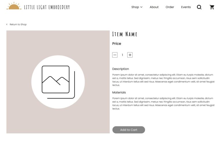
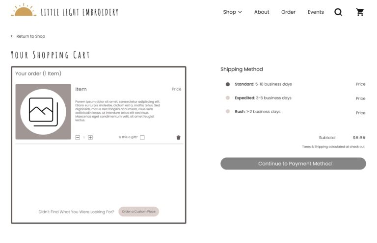
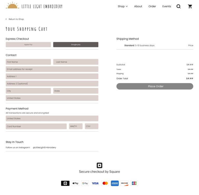
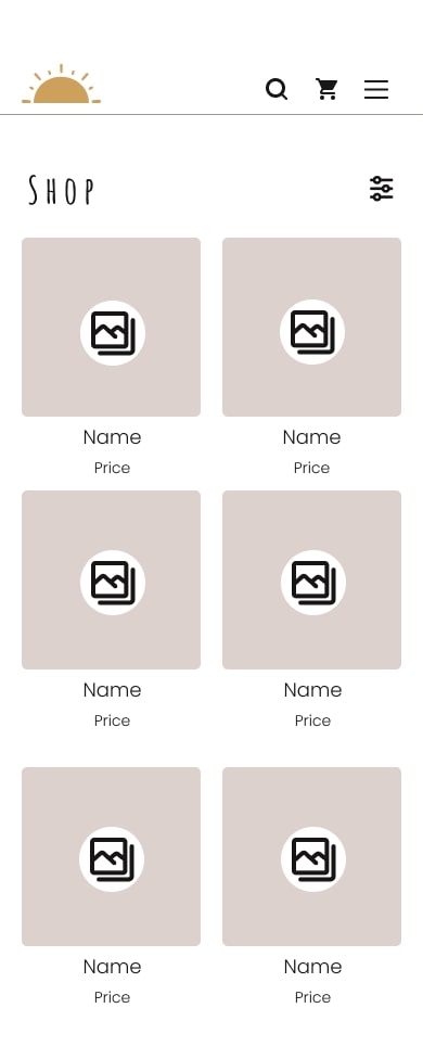
Clarity, cohesion, and concision on our final test was the general consensus in our feedback. There were minor fixes to finalize the site. Side menus, moving headers around etc. But the goal of creating a good high fidelity mockup that met our goals for product clarity, better visibility, and inviting home page design were met!
Desktop
Mobile

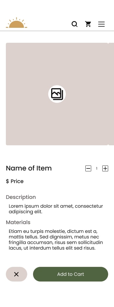
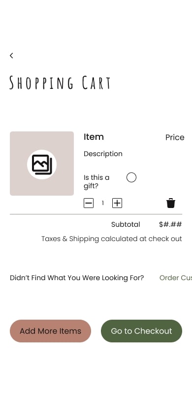

High Fidelity Designs
With selected side by side screenshots of the original site design.
Prototype
Conclusion
Next Steps
This project was a great success! With more time, my team would have continued improving the information architecture and filtering systems on the shop. We also would have like to have taken it a step further to actually implement the design on the CMS and create branded packaging materials for the client to use.
Lessons Learned
Design projects often require flexibility and the ability to adapt to changing circumstances or client requirements. Several times the team had to adjust pivot and adjust our approach, iterate on designs, and embrace new ideas as the project evolved. Having planned check-in points with the client gave us time to adjust our project without losing momentum and keep up the excitement among all stakeholders.
Having defined roles early on helped avoid confusion, ensured everyone knew what was expected of them, and promoted accountability from all team members within the group. Doing so gave us the opportunity to leverage the diverse skills and perspectives within the group!


